My media product
is the production of an extract of a music documentary based on looking at
local bands, and how they survive in towns, which are not normally known for
producing bands/musicians, or to come from a more creative background. The
videos, which were filmed separately to become the extract – showing the basic
format for the show, are simply shot, in a documentary style, which means that
it is far more realistic, and just presents a snapshot of the bands instead of
an in depth look at each bands psyche. It is designed to promote local music in
places, which nationally would never be looked at. I wanted the documentary to
feel warm, and friendly, something made that way due to the bands themselves (I
chose no completely niche bands – trying to keep them broad but still ‘indie’
so that they would appeal to my target audience. The main influence upon my
filmmaking was Roger Sargent’s ‘There Are No Innocent Bystanders’.
I think that the influence from his
filmmaking style, and the way he presents the subject are visible in my film as
well as some of the camera angles he chooses – which for the most part are very
simple but from time to time are very interesting (he is a music photographer
as well as filmmaker) which makes for a better film. There are also varying
other influences in my filming, the narrative and the shots I wanted and to get
the look that I wanted I used an 18-55mm lens on my 650D… meaning that I could
get shots of either the whole band as they were playing or very intimate shots
of only the one parson at a time, or just instruments. This allowed me to draw
focus very easily to certain parts of the track visually, and emphasize either
the lyrics or the guitar at a time and focus on them singularly.
A series of screengrabs from whilst I was editing:
.png)
.png)
.png)
To keep a certain level of verisimilitude,
I always hand held the camera, but mounted on a tripod to give it good weight –
and a lower center of gravity meaning there is only slight camera shake which
is like someone is stood observing. For filming the drummer however I almost
always let the tripod rest because the drums are so stationary I didn’t need to
track movement, and it allowed me to take photos as well with my film camera –
something that would help as promotional material for the documentary.

The contact sheet from my film camera at The Warren whilst I was filming
When filming, I did however try to avoid
going below 25-30mm because it would lead to wide-angle distortion, obviously
something which would not help the realism of the film. Because I was shooting
indoors, there wasn’t really enough light for me to have the aperture at
anything but its widest – meaning there is very slight bokeh in some areas,
obviously something I wanted to avoid because the way it undermines reality of
the film – as well though, I didn’t want to use any form of portable studio
lighting because it means that I am no longer using the ambient light of the
room – something I aimed to do because of the way it brings the audience into
the footage more, and makes it feel more and more like they are part of that
recording. I wanted very sharp footage,
so shot in full HD (1080p) because otherwise I don’t think the footage would
have looked nearly as good – because this standard quality helps the reality of
it but as well gives the film a very crisp look, meaning that it also looks far
more professionally produced; this did mean that there was far more space taken
up so I bought two 32GB Class 10 SD cards to make sure that they wouldn’t write
too slowly and also I wouldn’t fill both the cards during filming. Because the
low light, I had to make sure that I was at 200/400 ISO, because any higher
would mean a vast reduction in the quality of the footage. It was set to 25fps to
try and capture as much as much as possible, and making it easier to sync later
in post production – especially because I had to get the audio and the video at
exactly the same time.
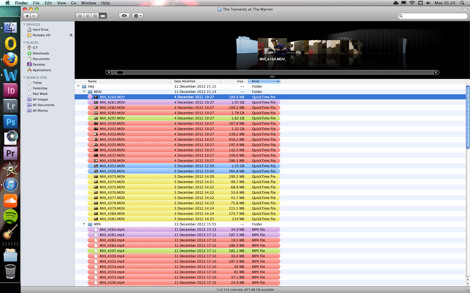
The first thing
I did when I started to begin the cutting of the video was to go through the
files using RealPlayer; this application allows the large MOV files to be
played at real speed, so that I could go through all the files first and check
which were usable, then convert the ones I wanted to use to an MP4 file instead
– this is smaller whilst also retaining a lot of the image quality. I would
then separate and colour code all the video files I had from filming, which
meant that I only had to import certain files into Premiere Pro – meaning that
I didn’t have to go though all the files within the program, something that was
essential making sure it didn’t lag when syncing the video and also meant I
knew all the files in one premiere pro file were all for one track, and I could
cut and chop them to sync to the timing of the track. Each part of the video
was created separately, saved as an mp4 and then brought into one video, rather
than all being done at one because it would have made for a far too overloaded
timeline.
The folders after they were organized according to what they were of
 A print screen from when I was editing using Premiere Pro
Using the razor tool to cut the interview into sections, allowing me to edit much more easily and cut out anything that was unusable quickly

Fading the track out before the interview, to smooth the transition between the two items

Because of the wind in the second interview, I had to cut out the bass frequencies in order to get an audible, usable interview
I didn’t want to add too many effects to
the video –as then there would be would be a lack of realism and the
documentary style of the video would suffer for this; therefore I decided that
I should only lighten the video very slightly and also up the contrast – which
means that the image doesn’t look too linear and makes it crisper because the
dark areas of it are far more impressive too.
In some areas of the final footage I think
that there is an element of Jools Holland style band/artist filming, where the
camera is completely still but then in others the camera is slightly more jerky
and more steady cam, which I think works better because it makes it more
personable and intimate for the audience with the band.
The Libertines on Later With Jools Holland.
The Vaccines live, filmed by Roger Sargent.
The Tube: Hull Band Special - the raw, more roughly made documentary style programmes like this give a more DIY feel - meaning that it is actually promoting ordinary bands, rather than trying to create stars.
Later With Jools Holland is shot very smoothly, with complete stage lighting, which seems to almost disassociate the band with the audience, something I tried to completely avoid in my documentary.
New media technology played an essential
part in the creation of my documentary – from the filming (as mentioned above)
being able to be done on my own camera – which was essential in being able to
film in manual and change all the settings myself – meaning that the end
results were much better because I was used to handling it, and I was never
restricted to when I could film. Digital technology means that it is much
easier for anybody to use techniques now for simple photography, filmmaking and
design, which would have previously only being available to professionals. For
example, a free trial of Premiere Pro meant that I could do all of my editing
at home, meaning that I had far more time to edit and thus it was much more
efficiently done. New media like YouTube also meant that I could find tutorials
on how to use Premiere to do certain things and InDesign (for my double page).
This meant that I had a much smoother edit than if I had of done it any other
way which was reasonably well put together for a first time editing video. I
used InDesign rather than Photoshop for the double page listings because it is
better for large amounts of texts, but only really works if you have a good
idea of what you want to end up with. Because my double page was based quite
rigidly in a formula The Guide uses weekly, I knew exactly how I wanted it to
look so as soon as I had put in the photos and text I could tweak to ensure
that everything fitted together just right and didn’t look out of place. For
the poster I used Photoshop, because it was a very simple design and Photoshop
makes it far easier to handle the images that I used. This meant that I could
produce materials to at least I think a semi-professional quality because of
their simplicity coupled with boldness.
I think that my ancillary texts (the poster
and the TV listings double page) conform to the conventions known to my
audience – which is what makes them successful counterparts for my documentary.

One of the main ideologies behind the poster was to make sure that it was as simple as possible, which I think makes it a lot more bold - and helps to make it stand out much more especially with the positive balanced on the negative space almost equally. I wanted each of the images to be different (it was also key to try and use different photographers) to highlight that they are completely different bands - something that relates to the broadness of Hull's music scene.
Although the series is across the UK rather than just based in Hull, the poster references only Hull because I wanted to make sure that they documentary still felt local to each area – rather than being a large corporation-made documentary which would make the series feel like there was no sense of independence – something very important when the main aim of my documentary was to uncover ‘indie’ music in alternative towns/cities.I always knew that my documentary would not be aimed at a mass audience - I think the ancillaries and my documentary reflect this because of their aesthetics and ideology being more alternative and subtle.


It was based on a flyer for Richard Hawley's Hull City Hall gig, and a flyer for The Crookes. Both of these flyers are very simple - with the Richard Hawley flyer being only in black and white with bold white lettering making it stand out; and The Crookes' flyer uses parallel lines in order to break up the flyer and draw focus around certain areas - which I have done with the main title in the poster above.
I think that my poster breaks the mainstream convention to appeals to a more niche audience - simply because it is more understated than posters usually would be; this also helps to appeal to my niche target audience who like the style of music because it is a more mature subtle/understated design.
One thing that I would change about the poster is that I would use different photos – I like the top photo because of its neutrality and colours, but I don’t think the three central photos fit together completely. The image of The Talks on the right looks slightly less sharp, whereas the other two are much sharper and use colour more effectively to draw the eye.

I have placed my double page spread in The Guardian's Guide - a supplement with The Guardian on Saturdays which includes TV, cinema, theatre, comedy and music listings; as well as other articles regarding popular culture. The audience are more mature, and well educated, therefore are more suited towards a music documentary like my own. Because The Guide's listings are national, it also applies to my documentary in that way because it doesn't only cover London - or larger cities in the UK; which would all be featured in the whole series for the documentary.
I wanted my double page to have obvious relation to the poster, otherwise it would mean that they would look completely non related, although at the same time I didn’t want it to be the spitting image of it because it has to look independent and as if it was designed by someone else. Again I wanted the design to be very understated because of The Guardian’s readership being more mature – therefore not needing the same sort of stimulation as a magazine like NME which has a much younger audience.
I wanted the page to be as minimalistic as possible, therefore didn’t bring any completely new colours, and stuck to the black and white classic print apart from the green subheadings. I used green because it the eye is first drawn to the two top left images, both made up of more green which means that the images sit much more nicely and leads the eye across the article, drawing it in more.
One thing that I would change on the double page listings is that I haven’t used a byline/tagline to draw the reader in more straight at the start – although it is hard to see how it would have fitted in without breaking the aim of keeping the page very minimalist and above all else not looking cramped at all.
In conclusion, I think my ancillaries work well because of the way they keep a distinct house style with the fonts used (which are the same as in the actual documentary too) and the colour schemes, which I think creates a cross form synergy when put together. The shared elements between the three texts means that they all work well together – and the audience, viewer or read doesn’t necessarily need to see the title in order to recognise that they are from the same production and that they go together.
I tried to make sure that I used a variety of different photographers images for the double page spread and the poster to ensure that there was a distinct feel between each image to ensure that they were seen as completely unique bands that weren’t necessarily related – part of my underlying ideology to promote music in more alternative places.
In my audience feedback it was generally said that all three texts work well together, because they have the same ‘feel’ and therefore go together well. It was said that this is mainly down to the choice of fonts and the style of design. The first piece of audience feedback I did was with Laura Jenkinson, and it was a broad interview about music documentaries, this audience feedback gave me what sort of audience I need to aim for, as well as key parts of the documentary that I needed to focus on. As my main influence on the documentary was ‘There Are No Innocent Bystanders’ by Roger Sargent, the key part of the interview was to do with the film’s trailer and how they thought it worked well or not.
I then went on to use questionnaires rather than filming, as it meant there was less time preparing and uploading and it allowed the participant to complete it in their own time, whilst watching the trailer or my documentary. I then turned these questionnaires into GoAnimates:
Audience Feedback 1 by Wes Foster on GoAnimate with Joe, an avid music lover who was in various bands whilst The Libertines' made indie popular as a genre
Audience Feedback 2 by Wes Foster on GoAnimate with Linda Johnson, who likes various music and watches shows like Jools Holland often.
As can be seen from the above interviews, most of the reactions to my documentary were positive, and for the first drafts seemed to say that the camerawork was good – and the editing works for the tracks, but the video needed to be cut down a little because it was too long, and because disinteresting. Another common flaw was the first interview, which had to be redone anyway because the sound had completely not worked – plus with two subjects it was hard to get them to say enough for the interview to really say something. Therefore I used the introduction with both the drummer in The Tennents, Sam Mackereth and the guitarist Matty Connor. Then after that I only used segments I did with Matty at a later date. Even though the sound quality still wasn’t anywhere near perfect because of the wind (I was using a hotshoe mic) it worked far better than the original interview, although when the mic was on top of the camera most was lost, whereas when it was held in hand it work to a good standard. For the documentary I didn’t want a ‘perfect’ quality interview, because it wouldn’t really fit with the rest of the camerawork, which is at times scrappy and a little shaky; although I think this adds to it and gives it more character, rather than being filmed completely smoothly like most music TV shows do, for example Later With Jools Holland and so the more raw filming works well in my documentary I think, and makes the video slightly better for it – therefore if the interview was perfectly shot, it would not have suited aesthetically to the rest of the documentary and the DIY feel I think it creates; something very important in my documentary because of two things - making sure it had strong ties to the 'indie' theme, which is rooted in punk and DIY as well as making sure that everything which I shot felt independent, rather than something commercial and manufactured.


